While there are a lot of sites dedicated to aiding designers in finding the right color palette— kuler is my favorite —most seem rooted around arbitrary palette recommendations. I know for a lot of designers choosing the right colors feels like a lot of new age voo-doo trying to cast a spell to match a desired affect with samples from the chromatic spectrum.
This is probably why one of my favorite design reference books for choosing a palette of colors is Color Image Scale, a book that takes color picking to a new level, distilling the emotional affect and essence of a color combination with “science”. This little red book from Japan is written by Shigenobu Kobayashi, Japan’s leading color psychologist. Over fifteen years ago, he and his team at the Nippon Color & Design Research Institute matched 130 basic colors and over 1,000 color combinations to key image words to help designers express any mood, life-style or taste through color palettes alone.
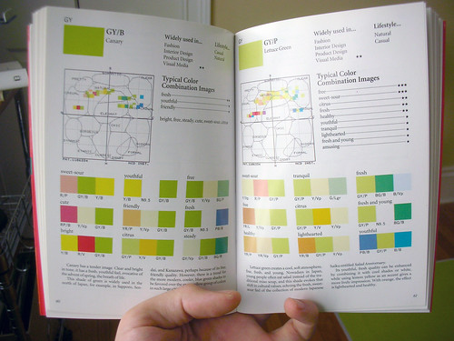
The book is a surprisingly practical resource that can be used by both professionals and amateurs in virtually every profession involved in design and aesthetics. There are two ways designers can take advantage of Kobayashi’s indexes. One approach is to decide on the affect you’re trying to achieve (“traditional,” “refreshing,” “amusing,” and “romantic” are a few examples) and look up the word in the key image word index to decide on any of the dozens of color combinations listed under the entry.
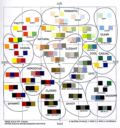
The other way is to decide on your colors and look them up in the color index to see how various combinations suggest various moods. I always love picking up this book and browsing through the page. Even though CMYK and RGB values are not given, (this guide was initially created to explain the results of his research) Kobayashi’s book is a fountain of inspiration. It’ll help you turn away from staring at color wheels and move you towards thinking about your product’s or service’s emotional end game.


It is a good idea. But usually any design decision will include a lot of other parameters. Right? “Even though CMYK and RGB values are not given” - how come web developers can use them then?
I’m sure your Japanese readers will be pleased! ;-) I’d be slightly worried about cultural differences…
That book looks cool. Would be a great gift for friends, if you had designers for friends. Sucks that there isn’t any color identification (hex, rgb, cmyk).
hahahah yeah… love that book in fact I already have that one… I highly recommend that book for designers…
Ericksonx From Juricks2Web.com