Introduction
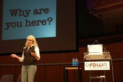
It’s a fickle world out here on the Internet and I’ve gotten used to bloggers coming and going, but my heart (and feedreader) still feels a deep pang of longing since Kathy Sierra’s exit from the scene over a year ago. Creating Passionate Users was and still is my favorite resource for inspirational outside-the-box ideas for reaching out and exciting our users. And so I was delighted to hear at the beginning of the year that she would be speaking in our neck of the woods in Miami at Future of Web Apps.
And it was fantastic. No surprise, I know, but Kathy Sierra has that rare ability to never disappoint and I think that’s remarkable. She titled the talk, Cognitive Seduction 3.5 (Here’s the audio, transcript and slides), and it was an updated lecture of her developing thesis of how software can take advantage of what science tells us about exciting our mammalian brains. What I want to share with you is one of the things we got out of her talk that’s definitely had a nice impact over at Wufoo.
One of the highlights of the presentation covered the importance of addressing your users’ feelings. Establishing empathy is one of the harder things to recreate over the web and Kathy showed the irony of designing and approaching customer support as if your user is blindly excited to be going through forums and documentation to troubleshoot their issues. There’s a disconnect in those situations because we often forget that real-world interpersonal communication is 90% non-verbal. And while the dream may be to look at face recognition technology for what the future might hold for customer support, that future, unfortunately, isn’t here now.
A Delicate Thing to Ask
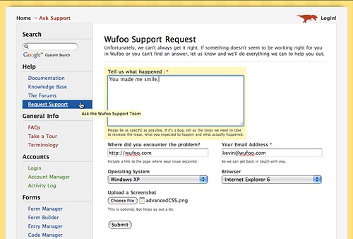
The idea I came up with as an alternative was that while we couldn’t passively detect our user’s feelings we could actively ask them. On Wufoo, if you can’t find the information you need to help yourself, we provide a Support Request Form to help us identify and track your issues.
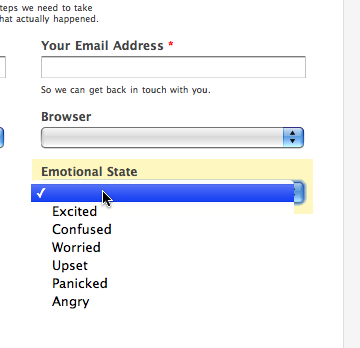
My idea was to simply add a dropdown field of possible feelings to the form and have them select the appropriate one. The tricky part we realized right away was in the copy. The obvious way to ask this is to write “How are you feeling?” But as soon as we wrote it, it felt all wrong. Basically, no customer support person would actually ask that in person especially if that user was visibly angry.
When you get to Wufoo’s Support Request Form, it’s because you couldn’t find the answer on the site and so we knew there was going to be some level of frustration brought to the table when encountering this type of form. Additionally, if you’ve never experienced customer support with our team, then you might also be skeptical about how things are going to play out based on past experiences with other services. Anyway, with that baggage of frustration, “How are you feeling?” ends up sounding condescending and I think it’s because it has connotations and allusions to being in a room with a psychiatrist, which is probably not the person you’re interested in having solve your technical support issues. Even I had a visceral reaction to the language and I made the field. And so after some fiddling, we ended up going live with “Emotional State.”
It was the most neutral wording we could come up with and I think in context of the form, it fit because like everything else on there, it was ultimately about trying to efficiently get to the core of the user’s situation.
Now, this isn’t the first time we’ve taken to heart past advice Kathy Sierra has given on customer support like making our help and documentation as good as our marketing materials. The changes we made there worked out fantastically for us and actually cut down our support requests by 20% as soon as we implemented it. That being said, I didn’t really have any expectations for the Emotional State dropdown. I was curious, but didn’t have a working hypothesis for what was going to happen. Part of this is because I’ve given up on predicting the future since everything always seems to be a surprise when it comes to users, but we were also not planning on changing how we reacted to a support request based on that dropdown (we answer every request as it comes in as fast as we can, regardless of whether that user is paying or not). And some of us were even skeptical that it would be used since we didn’t make any announcements and didn’t make it required on the form.
The Results
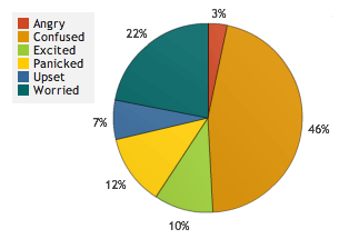
We added the emotional state dropdown to Wufoo’s Support Request Form on March 1, 2008. As of the writing of this article (July 16th, 2008), we’ve received 801 support requests since then and 607 of those requests specified an emotion using the drop down, which means 75.8% of our users needing help were willing to share that information. To put that into perspective, the percentage of users filling out what browser they’re using in the form is only 78.1%. So much for users not using it or thinking it’s not pertinent to solving their problems. Here’s the breakdown of the emotions that were collected.
| Emotion | Number | Percentage |
| Angry | 20 | 3% |
| Confused | 278 | 46% |
| Excited | 61 | 10% |
| Panicked | 73 | 12% |
| Upset | 41 | 7% |
| Worried | 134 | 22% |
| Total | 607 | 100% |
Additionally, not only did people use the field, they were moved by it. We were surprised at the number of emails, blog posts and articles written about this little dropdown. And the thing is, that was never our intention. We didn’t really want to bring attention to something like this, because if there was any magic in it (positive impacts to the user experience), we knew, like all things magical, that the spell would be broken if efforts were made to exploit it. The reason we’ve decided to share our experiences on Particletree is because 37Signals wrote recently about a design decision to not go forward with a similar change to their request form and we felt that was a shame since the benefits we received were greater than just a better understanding of the nature of the user’s request.
For example, if you’re a fan of the writings of Jacques-Marie-Émile Lacan, then you know that written language is often a poor medium for expressing our thoughts. Before we added this drop down, and I never thought about this before we introduced it, our users had to compensate with tone and voice. One of the best things to come out of this is that the language used by our users to describe their issues now are more rational and dramatically less expressive (ie. nasty, filled with capital letters and exclamation marks). Ben McCann explains this best:
GetSatisfaction.com also has this feature, which is really nice when you’re upset because you can express that without getting nasty. I’ve been in many situations where I’ve only gotten help from the customer service reps if I’ve gotten upset or angry at them. Now it’s almost my default to be angry when talking to someone in customer service because of how many times I’ve been ignored while being polite. However, when I see something like this it calms me down because I get the sense that the company will listen without me having to be a jerk. I much prefer being able to leave a courteous and informative message and I’m sure the people working in customer service prefer it as well.
And he’s right, when it comes to customer support, I’d much prefer to deal with Mormons over prison inmates. A request that’s polite makes doing what you need to for your customers, which is often repetitive and frustrating, noticeably more pleasant. In our company, where every employee is required to handle a percentage of customer support, that’s a big impact on the everyone’s state of mind during what’s usually considered a grind in other organizations. Also, when 70% of your support requests all of a sudden become nicer, when the calls for help are noticeably more polite, you tend to go the extra distance. It’s a self-serving cycle that couldn’t have been predicted if we didn’t actually try it and honestly shouldn’t be underestimated when it comes to providing quality customer support.
Another thing that’s surprising to me in hindsight is what appears to be the relative honesty of the feelings expressed. If you’ve ever been to an emergency room, one of the first questions they ask you is to rate your pain on a scale of 1 to 10. It’s obvious that they use this to triage patients and so veterans of the system will exaggerate their pain level to reduce the time they spend in the waiting room. Chris had first-hand experience of this when he injured his ankle and the boy scout in him wouldn’t let him utter a number higher than 3, which resulted in a 6 hour wait for an xray while level 8 ear infections and pink eyes plowed ahead of him. Now, our users didn’t know that we were NOT going to use the emotional state as a way of setting priority to a request, but it turns out, for the most part, most people did not try to game the system. One theory for that is there wasn’t a feedback loop for this kind of behavior. Because we didn’t act differently, our users didn’t react to the dropdown as a variable to hack.
Final Thoughts
One thing I’d like to note, though, is that this is not a plug-and-play solution. I hope no one takes from this article that all you need for good customer service is to add a dropdown like this to your support request form. I truly believe that the motivations have to be genuine and part of a holistic approach that values your users’ satisfaction. If you don’t believe or really care about your users’ feelings, then this is probably going to backfire on you. The most important part of a request form is responsiveness (getting the problem addressed quickly and fixed). Once you have that foundation laid, then I would recommend assessing the emotional impact of the situation.
I know there are pessimists out there that think this touchy-feely stuff is bound to annoy more people than help them, but our users have responded surprisingly positive to us just asking the question. It’s about comfort. I think it might be that programmers, engineers and hackers are usually all about efficiency. You don’t need empathy to fix a bug or answer a question. It’s not a class they teach in Computer Science. But at Wufoo, we’ve come to discover that knowing how a person feels is one of the first steps towards humility. If our users are constantly confused or upset about how to do something in our application, then obviously that’s a failure on our end. Humility helps us accept our short-comings and make the changes necessary or help the person in a way that provides, in the end, a satisfying experience and a lasting relationship. And while that’s not something you need to fix your software, it is a vital part of running a good business.


Wow. What a fabulous post. I really appreciate you sharing both the details and the motivations with us.
My one fear here is that some yutz at AT&T will now add this as a push-button option, so that they can indicate caring without actually doing it, and that people will eventually become suspicious. But it is ever thus, and I’m sure by the time that happens, you folks will have found some even better approach.
That is very interesting. It would be fun to try different variations on that idea to see how users respond. Maybe adding a touch of humor would help brighten their experience (like a creative 500 Internal Server Error message usually does for me).
Hey Jason, I understand the source of your suggestions and I think some of them might be interesting to try, but as I mentioned…the point where the user is having a problem is a very delicate situation. Humor does sometimes lighten the tension, but I think that’s usually where you find yourself dividing people with very different reactions to lightheartedness, especially when they’re under stress. This is why we try to make those points of interaction some of the most neutral on our site.
Because of the nature of our team, Wufoo does have a more casual personality, but we’re always very careful to put a lot of thought into the copy on our site. There is a fine line between being friendly and being a jester, or worse, someone that’s using a gimmick to manipulate emotions.
Excellent blog post. Really. Out of all the noise that’s generated every day, even by such fine folks as the 37S crew, this is definitely worth reading and recommending.
Everyone needs a hug.
“If you’ve ever been to an emergency room, one of the first questions they ask you is to rate your pain on a scale of 1 to 10.”
Huh. I’ve been several times, and nobody’s ever asked me this — even when I was bleeding from a hole in my head. (Or maybe I just don’t remember it.)
Consider yourself lucky, Ken. Maybe they just don’t ask when you have a hole in your head =)
This is interesting idea and the results are surprising to me. I would guess that most users will ignore that and won’t respond:)
I simply love your posting, Kevin, kudos. This is what distinguishs your thinking from those of 37signals: you really care. It’s not about prioritizing, it’s about understanding your users.
What a great feature that obviously evokes a response from the users and also helps you as the company know what they are feeling. Awesome article!
Thanks for sharing this, one of the most useful blog posts I’ve read in ages!
That is such a great point you make. Your users are your most valuable asset, why not leverage them?
Wow. A little context would be helpful here. Please put a note after the Slides link “[69.9MB]” Thanks.
On a more topical note, the most common scenario is that people just want a problem fixed. Consider this, something went amis and you’re really mad at your friend/spouse. How would your already-negative state be affected if their first response was “How are you feeling?”.
Understanding feelings is something that could/should predominantly be dealt with from an implicit perspective. Besides, I ran across one of these dropdowns recently and none of the options met my needs. What likely affect do you think that had on my relationship equity?
Indeed the real focus is Relationship Equity — will the action increase the perceived value of the relationship or decrease it? Emotion is just one of many elements in the relevant behavioral economics.
Lastly, data has to be actionable. Knowing their emotive state (although I will agree that for something like GetSatisfaction it is CLEARLY relevant) might be interesting, but is not actionable (GetSatisfaction isn’t taking any action).
Your primary focus in collecting this data and evaluating it is to better inform your design. There is an economic cost to everything. Spend everyone’s resources wisely (are you wasting ‘my’ time and yours?).
great article, thanks for sharing.
Moze akurat to miec znacznie “favorite resource ” bowiem ? znaczy inaczej na forum
Paula,
Please /cry more.
70mb isn’t a lot.
Obvious troll is obvious.
That is all. Thank you.