Introduction
In preparation for the redesigns and overhauls we implemented in Wufoo, I took some time to revisit a few HCI (Human-Computer Interaction) fundamentals with the hopes of gleaning something new out of the decades of research dedicated to making interfaces easier to use. One thing that surprised me was how most of the material was pretty dense, heavily geared towards mathematicians it seemed and written in the impenetrable language of the academic elite. You’d think that if they’d really wanted to make an impact (especially on designers), they’d create documents that were a bit easier to digest.

Back in school, I remember that it wasn’t until I started taking classes in physics that calculus made any kind of real sense to me. I just need diagrams to function. In that spirit, I thought it would be nice to go over Fitts’s Law, a staple in the HCI diet, with a few visuals to explain both the concept and why it’s ideas are a bit more complicated than most would have you believe.
Math of the Obvious
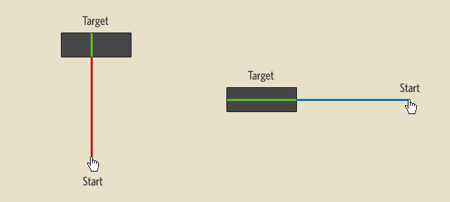
Published in 1954, Fitts’s Law is an effective method of modeling the relationship of a very specific, yet common situation in interface design. That situation involves a human-powered appendage at rest (whether it’s physical like your finger or virtual like a mouse cursor) and a target area that’s located somewhere else. Here’s diagram the first:

Mathematically, Fitts’s law is stated as follows:
MT = a + b log2(2A/W)
Basically, that means that the time to acquire a target is a function of the distance to and size of the target. It seems like a no brainer. The farther you are and the smaller the target, the longer it takes to move the cursor and point at said target. However, Tom Stafford said it best:
“Although the basic message is obvious (big things are easier to select) it is the precise mathematical characterization that is exciting, and that this characterization includes a logarithmic function - which means that the shape of the relationship between size and reaction time is curved so that small increases in size for small objects make it much easier to select them (whereas small increases in size for big objects don’t make that much difference). And the same applies for changes in target distance.”
Just to bring it into the real world, this makes sense since a penny is a lot easier to point at than a freckle and a house is just as easy to point at as an apartment complex. So the next time you optimize your web site based on Fitts’s Law, remember that if your link is already huge, making it “huger” will not significantly increase the speed at which one can access it. However, making tiny links a little bigger does make a difference.
Fitts’s Law is Made of Lines!
Wanting to find practical lessons from Fitts’s equation, interface designers have derived a few rules of best practice to take advantage of one of the very few laws of human interaction. One rule, The Rule of Target Size, combines ideas behind Fitts’s Law and Hick’s Law (a law I’ll talk about on a later date) to state that the size of a button should be proportional to its expected frequency of use. Bruce “Tog” Tognazzini of Apple interface fame even developed an excellent quiz to explain how Fitts’s Law can be used to develop rules to drastically improve operating system interfaces.
Before you go and follow these rules blindly in your applications, I want to remind you that Fitts’s Law describes a very specific situation. There is an assumption that the movement from the starting position is rapid and aimed, which means it’s always in a straight line and confident (starts with high initial velocity as if there were no other targets and you knew exactly where you needed to go). Also, I’ve seen a lot of people think Fitts’s Law describes the following situation:

However, in the equation shown above, there’s no variable for height of the target area, only width. And so one of the most talked about limitations of Fitts’s law in HCI circles is that it predicts movement in only one dimension. In Fitts’s original experiments, he actually only tested human performance in making horizontal moves toward a target. Both the amplitude of the move and the width of the terminating region were measured along the same axis, which means the model it describe looks more like this:

Now, if we were to base link size optimizations solely on Fitts’s Law and we assume that vertical and diagonal movements can be described using the same equation, then the ease at which you can point to a specific target actually depends on where your starting position is in relation to your target.
In the example above, the cursor on the right will technically have an easier time selecting the target than the cursor on the left since it will have more “target width” to work with. Notice that Fitt’s Law would work fine for circular targets since the width to the center of the object would be the same from all angles. However, it becomes less accurate for rectangular targets and even more so for irregular objects. In the next example, we’ll look at two attempts to optimize the target area of a link by increasing rectangular dimensions.
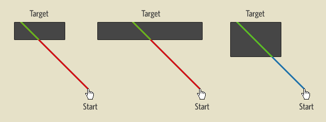
The second figure increases the width of the target box and the third increases the height. As you can see, based on where the mouse cursor starts, not all size increases on a rectangular target result in an easier target acquisition, which could be significant for web designers considering all CSS designs are based on the Box Model.
Physical vs Virtual Pointing
Hundreds of derivative experiments have been performed since the publication of Fitts’s findings. One interesting paper from 1996 by Evan Graham and Christine MacKenzine, analyzed differences between how well we pointed at objects in real space versus objects on the computer screen. They show that the movement from the starting point to the target area could be divided into two parts: the initial high velocity phase and a deceleration phase.
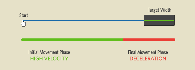
In their study, they discovered that the first phase was only affected by the distance away from the target. The scale of the display nor the size of an object didn’t make you approach it more quickly from the start (bigger links don’t make you more eager). The phase that actually affects the time to select a smaller object at the same distance, is in the deceleration phase. Now, here’s the “interesting” part:
“The difference between the virtual and physical display is apparent only in the second movement phase, where visual control of deceleration to the smaller targets in the virtual task took more time than in the physical task.”
Basically, links and buttons on a screen are harder to point out with your mouse than with your finger. And the problem with mice apparently is not in their ability to get to the target, but in our ability to decelerate accurately with them. Apple, I eagerly wait for the release of some multi-touch monitor goodness.
Rule of the Infinite Edge
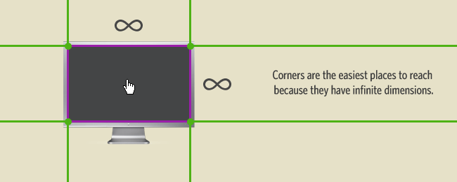
It turns out that computer monitors add a very interesting twist to Fitts’s model of target selection, because they have something called “edges.” Jeff Atwood of Coding Horror actually explained this rather excellently last year in an article on Fitts’s Law and Infinite Width. Because a pointing device can only go so far in any direction, targets at the edge of the screen technically have infinite target widths as illustrated below.
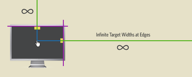
For an operating system and on any full screen application, these edges are usually considered the most valuable real estate since they are technically the most accessible. Not only do they have infinite widths, they also don’t require the user to have a deceleration phase when they approach these targets, since the edge of the screen will just stop them. This is also why it’s incredibly fast and intuitive to assign actions like Expose and Dashboard to the corners of a screen.
Unfortunately, web applications do not get to benefit from the Rule of Infinite Edges. Having the limitation of needing to run in a browser window with borders, it’s of little value according to Fitts’s Law for web designers to place buttons and links at the edges and corners unless the browser is running at full screen, which seems to only happen for kiosk applications.
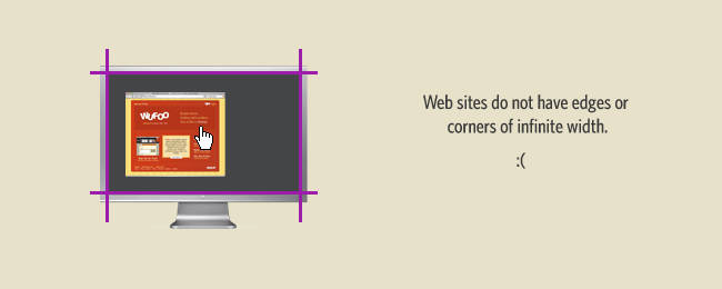
This also might explain why the interfaces of Web Operating Systems will never be as good as those that can take advantage of the entire real estate of your monitor.
Fitts Still Rules!
The few limitations of Fitts’s Law that I’ve presented here are not an attempt to have you throw its lessons out the window. My hope is that by illustrating some of the debates, it’ll show you how something as simple as pointing at something is just as relevant and debatable now as it was over 50 years ago. And while it’s technically not an accurate description of most interface situations—humans don’t always move confidently to a target, we don’t move in only straight lines, there are usually several targets that can confuse us and target areas are almost always two dimensional—research that has created a more accurate mathematical model that compensates for 2 and even 3 dimensions, hardware noise, human error and a host of other factors doesn’t seem to change the fundamental truths behind Fitts’s rather versatile equation:
“Fitts’s law has been shown to apply under a variety of conditions, with many different limbs (hands, feet, head-mounted sights, eye gaze), manipulanda (input devices), physical environments (including underwater!), and user populations (young, old, mentally retarded, and drugged participants).”
In the end, the big idea I’d like designers to take away from this article is that the challenge of software application design is so complex and filled with so many variables, that blanket solutions derived from Fitts’s Law should be used cautiously. With the increasing size of monitors, the rising popularity of variables that increase mouse acceleration and technologies that alter how we scroll through large screens, it’ll be interesting see how software designers will take advantage of tools that let us augment our ability to close large distances quickly.


Everyone needs a hug.
Very interesting article. When I studied HCI at university we covered quite a few fundamental usability theories, it’s good to see evidence of people applying these theories. The acceleration/deceleration aspect isn’t something I’d thought about before.
I think Alan Cooper pointed out that Fitt’s Law implies that besides the corners, the easiest target to acquire is “the current location of the pointer.” IOW, the biggest button is one you don’t have to move to at all. AFAIK this is not often used.
Cracking good post Kevin. I’m taking an HCI course at Georgia Tech and this is exactly the type of stuff we are covering in class. Also things like using Hick’s to calculate the exact time for bundles of actions and then applying Fitts’ to see what type of UI changes would speed that up.
It’s sort of sad to see how web apps can’t benefit from the Rule of Infinite Edges.
Another interesting link related to this subject: http://www.bram.us/2007/06/26/their-missing-mile-high-menus-and-magic-corners-fitts-law-vs-apple-on-windows/ ;)
Great article. I studied this stuff back in Uni, but have to admit I’d more or less forgotten it, this explanation brings it all back to life for me. Thanks.
This is very clearly explained and presented. Thank you.
If we had the possibility to trap the mouse pointer in an application window frame, one could benefit from the infinite width and point at the application level. Why isn’t this feature provided ?
We kind of have it in VirtualBox already. It’s quite easy to get used to.
Consider putting some of your pretty diagrams under GFDL or a similar license, and adding them to the wikipedia article about Fitt’s Law, which currently suffers from a distinct lack of pretty pictures:
http://en.wikipedia.org/wiki/Fitts%27s_law
Blargh. I can’t spell Fitts’s.
@ Jacob: It’s Fitts’ ;)
Great article! - On a food for thought note… do you think that having a “target” grow in size, when you get closer to it aids in the selection, or would it cause more confusion? I’m thinking of something similar to Apple’s Dock thing, where objects balloon in size, the closer you get to them… what was a ~32x32 pixel area (1024px target) grows to be a ~64x64 pixel area (4096px target) (4 times as “big”).
Also, as noted in your picture, the “classic” horizontal button works well for horizontal scrolling to select, but for vertical scrolling, it seems to suffer significantly… I wonder if the era of “closer to square” buttons is on the horizon? Especially since most sites fit nicely on screen in the horizontal direction, but most have lots of content requiring vertical scrolling.
Finally, in some applications (typically non-web based), sometimes target objects are “magnetized” to pull the cursor in, when it gets close.
I’m very much in favor of not overriding the end-users action, but I would be curious to see if any of these things help?
Outside of using flash (which is already user-unfriendly), I wonder if there is a site/example of a “growing” feature that reacts to cursor proximity? I would certainly want to try it out.
Everyone needs a hug. :)
@Steve: The dock actually only enlarges the target area in vertical direction when the zooming thing is on. Moving the cursor horizontally causes the big icon to move, and as such, there’s still only ~32 pixels horizontally to click on.
The fact that target area seems larger but is not makes it feel like the icons are “moving targets” when they shouldn’t be, and through a little more arguing one would come to the conclusion that it’s Bad Interfaceâ„¢.
Excellent explanation. It’s not a difficult topic to understand, but you make it seem elementary.
Related to how this affects web developers, Dunstan Orchard posted an excellent tutorial on “Link Presentation and Fitt’s Law” a few years ago: http://1976design.com/blog/archive/2004/09/07/link-presentation-fitts-law/. Interestingly, his implementation provides an increased horizontal target width for links, but not vertical. However, it works because he used it in his weblog’s sidebar, so most of the time users scroll horizontally (or nearly so) to hit the links (or are moving slowly over them vertically).
This is the best explanation of this I’ve ever seen. Thanks.
Very interesting, especially for a curious layperson such as me. On an iPhone (and possibly other similar devices), wouldn’t the Rule of Infinite Edges applies to web sites?
@ Sam: It would, if there were a cursor. I honestly can’t think of a way to apply Fitts’ law to the iPhone without breaking out some anthropometric data. Since the phone itself is “floating” in your hand, it could be either easier or more difficult to coordinate an action like pressing a button, depending on the user.
Everyone needs a nap.
@Bramus!: No, Fitts’ would be if a bunch of different guys named Fitt got together, and made a law. If you’ve got just one guy named Fitts, the proper possessive is Fitts’s. :) (See here for details)
Hey Jacob, that’s a great idea. All content on Particletree is provided under a Creative Commons license. For anyone that’s interested, here’s a link to all the images and PSDs from this article:
Fitts’s Law PSDs
@Steve: I invented the “magnetized button” for my Master’s research back in ‘94. It worked quite well for the simple cases, but there were some obvious usability challenges for screens with dense or large, evenly-distributed areas of UI controls. A pity I never got to pursue the idea any further…
Jef Raskin’s The Humane Interface is an excellent introduction to HCI. It deals with a lot of the topics covered in this post, like the Infinite Edge, Hicks, Fitts, et al. It also deals with other issues, like some of the modality stuff that his son, Asa’s carried on, with Humanized. It’s really really good.
@ Jacob Rus (and Bramus!): I think that you may not be right. You linked to a ‘singular nouns’ site. Fitts’ and Fitts’s are both versions of pluralizing a singular noun that end in an ‘s’. As a youth, I was taught: Mr. Jones’…but I believe the NY Times does Mr. Jones’s (personally I like the former version, but that may be a conditioned view). For plurals, the noun needs to be pluralized first (ala Joneses), so, in the current case, would it not be Fittses’ (or Fittses’s) Law?
The things I’ll do to avoid work…
Lol @ Eric :-D
However, I’m still sticking to Fitts’ Law as it’s 1 dude (Paul M. Fitts): Fitts his —> Fitss’ (and not Fitts’s as that would be confusing when pronounced [fitsis] ;))
In Tog’s first book, when he talks about Fitts’s Law, he mentions that since your mouse will eventually wear out, the edges aren’t infinitely large, but they are several miles long ;)
@ Bramus!: I agree with you…I was concerned that adding you parenthetically to the @ of my last post may seem to add you to the “I’m disagreeing” list, but it was merely to draw attention to your participation in the anal discussion. In the end, I agree with your usage of S’s and apostrophes. Congratulations! ;-)
As a tangent to a tangent, rereading the last bit of your last post, are you saying that you would pronounce the possessive Fitts’ the same as the name Fitts? Sticking with Jones as an example, I would pronounce the possessive as Jones-ez. In fact, I just took a little poll around the office, and people call it “Bridget Jones-ez Diary.”
Just to clear things up Fitts’ and Fitts’s are both correct. It is just a convention, and you can choose which ever floats your boat. Just stick two only one of the two
ps. great read btw!
Great reading - and great article. Thanks alot /Dennis
@Steve: The Dock icons do not actually really get bigger, they just look that way. Well, they get bigger in the direction of the Screen (i.e. vertically if the dock is at the bottom), but no in the direction of the edge, because they move in the opposite direction of the mouse.
The Dock zoom is useful if you have small icons so you can better see them; however, it does not help with Fitt’s law.
Hiya - interesting read but one thought struck when comparing web site layout with that of an OS. Whilst, for me, web sites do not occupy the full screen - I’m a Mac user and that’s the way we’re ‘conditioned’ - I would argue that for the majority of Windows/IE users, a web site does appear as full screen.
Before I stoke the fires up too far, I don’t mean power users with multiple screens but Joe and Jolene Public. Time and again when I’m working with Windows users I see everything be full screen, cause that’s the way that Windows assumes you will work… and people in general have got used to it.
Maybe it’s just the people I see interacting with Windows but I’d be interested in what others think and see.
Everyone hugs a need.
@Ross: I see exactly what you’re talking about a lot. I do IT support in a CS department so there’s a lot of variance, but one thing is a near-constant: Windows users with maximized windows, and Mac/Linux users without.
From the original article: “One thing that surprised me was how most of the material was pretty dense, heavily geared towards mathematicians it seemed and written in the impenetrable language of the academic elite. You’d think that if they’d really wanted to make an impact (especially on designers), they’d create documents that were a bit easier to digest.” Assuming ‘they’ are academics, they don’t necessarily want to make an impact in the sense that you or I might like to. What they want is paper publications, so they’ll gear their style towards the journals in which they hope to get published (and their fellow academics). But you knew that already, right?
Everyone needs a hug and Fitts’ law.
@MikeP
Sorry you’ve lost me! What’s your point!? :-)
As a corollary to the point about Fitts’s Law not addressing movement in multiple dimensions or amidst distractions, consider that the notion of a target is relative. Sure you may want the user to click a particular button, but if the layout provides all germane interaction handles in visual clusters, that cluster can become the initial target. During the movement toward the larger target, the user may subdivide and segregate specific target from distraction. By the time they’ve discerned their specific target, the distance that they’ll need to cross is lessened, and they’re already in motion.
No big science here. Just sharing a thought :)
Everyone needs a hug…just make sure the person you are approaching is sufficiently large as to acquire the target effectively. ;)
Fascinating stuff. It would be interesting to know how this is affected by the mathematics behind mouse movement (in other words the algorithms in windows and other OSs that determine how far the mouse pointer moves relative to the mouse, which prevent the need for a mouse mat as big as the physical screen amongst other factors.
Good explanation and nice graphics (with some formulas for the hard core geeks too). I think that Apple put the menu bar for this reason for every application on the top of the screen and do not attach them to every window like Windows does. This has interesting implications: the distance for a cursor to a menu under Windows is probably shorter then on a Mac but on a Mac is might be faster because it is easy to get to the top of the frame. Fitts’s law can tell us which strategy is better on a big screen resolution.
@Ross, sorry - more succinctly. The original article said, I paraphrase, “you’d think they would want to write things more clearly so ordinary people can understand them.”
Academics don’t want to be understood by ordinary people. They want to be understood by other academics, who won’t necessarily take them seriously if things are written in “ordinary people” language. If non-academics can understand the publications too, that’s not even necessarily a good thing.
But really, only the first paragraph was directed at you, the second was in response to a sentence from the original article. The first para was agreeing with you, from the perspective of somebody who does daily support for ~350 faculty members and grad students.
@ Richard Morton
My thoughts exactly, there was a very interesting article over at coding horror on the subject of mouse ballistics, and I’d quite interested to learn if there was such a thing as scroll wheel ballistics.
Jeff Atwoods article is here
http://www.codinghorror.com/blog/archives/000977.html
Interesting read! Any idea how that logarithmic relationship was derived? I would be interested to know if it is backed up with experimental evidence. I like the idea of applying analytical techniques to interface and web design, can we see more articles like this? Anyone got any good articles to share?
Excellent article - has prompted me to make significant changes to my upcoming site.
Thanks for the tips on Fitt’s Law, it’s nice to have a name for the linking convention. One thing I’ve noticed lately is a tendency of CSS designers to employ large link spaces. Many of the sites linked through CSS Vault have large link areas for main navigation. I’ve been seeing large link design for a while now, and it has bled into my own design work. I initially liked the look of the big links, but the access issues are even more reason to like it.I wonder how many designers are doing it for look and how many are conscious of Fitt’s Law. I would guess more are interested in the layout, but on the other hand I’m seeing this on well built CSS/XHTML pages, so maybe they’ve been aware all along..
Nice brainstorming on userinterface details, i hope to get to this level somethime